NSRR whole-dataset visualizations
To paraphrase the adage, a picture is worth a thousand numbers. In order to investigate some basic properties of NSRR datasets, here we generate a number of whole-dataset visualizations. To make sense of these images, we’ll employ a remarkably complex computational pattern recognition and dimension reduction framework, a.k.a. the human visual system. We'll illustrate how visualization can highlight temporal, ultradian patterns in sleep across many individuals; more generally, we'll also see how it can point to oddity and artifact in datasets, as well as acting as an hypothesis-generating tool, especially for complex, multi-modal datasets.
Sleep stage timing
For a single individual, the hypnogram is a common way of representing sleep dynamics defined in terms of wake and sleep stages. Below is a hypnogram for one individual, randomly selected from the CHAT study:
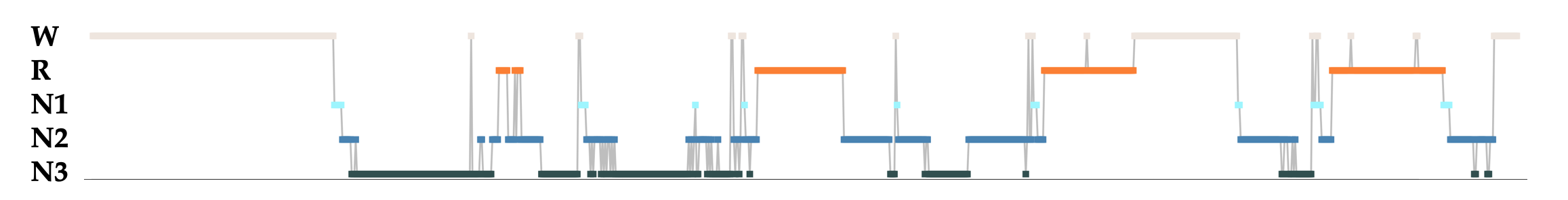
Each point represents the manually-assigned stage for a 30-second epoch: REM (orange), NREM 1, 2 and 3 (light, mid and dark blue respectivly) and wake (cream). As is typical in young sleepers, we see about four cycles of successive NREM and REM bouts, with progressively longer REM bouts towards the end of the night.
In the plots below, we'll compress a single hypnogram to become a single line, using only color to denote the changes between sleep state. Here is the hypnogram above represented this way:

Ultradian dynamics
We'll now stack many hypnograms (i.e. individuals) on top of each other, to obtain the gestalt of an entire dataset. Below are three plots, each of 779 individuals from the non-randomized arm of the CHAT study. In the leftmost plot, rows (i.e. children) are ordered by age (approximately between 5 and 10 years); the x-axis is elapsed time from the start of the recording.
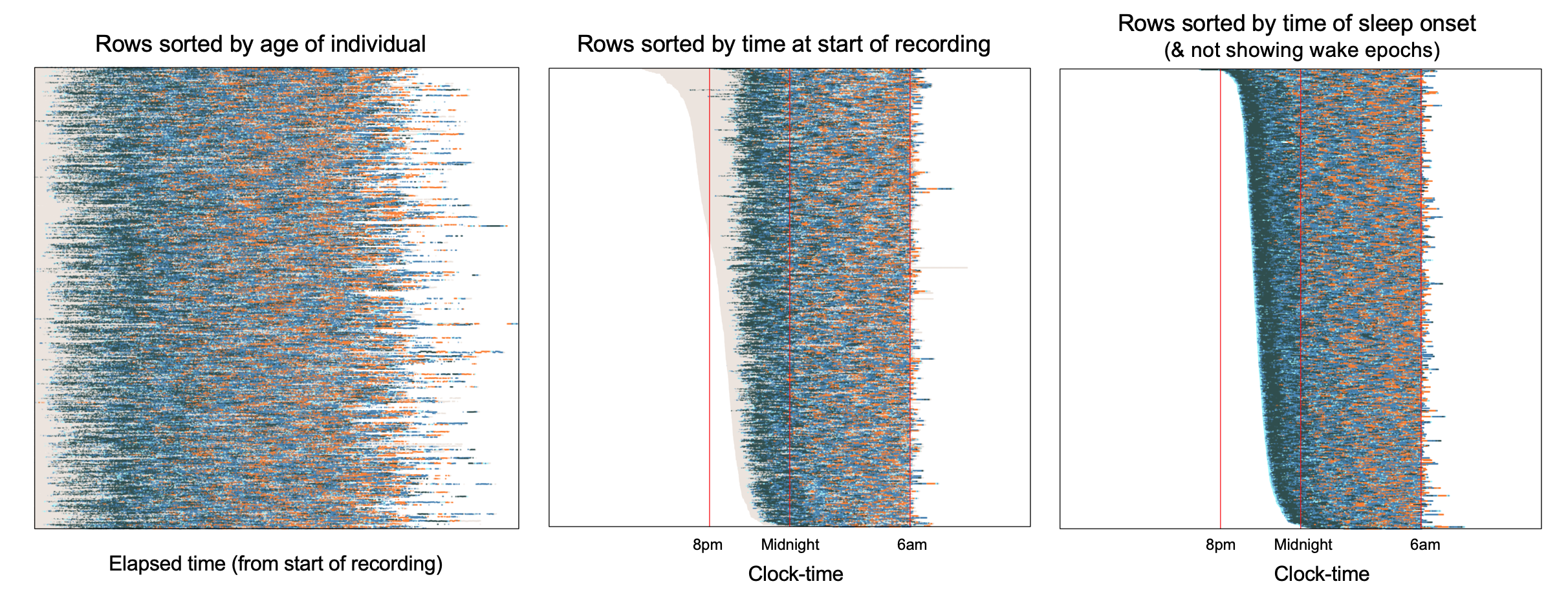
Especially at this resolution, it isn't necessarily easy to make out specific features when the data are shown this way, although we do see generally more REM (orange) in the second half of the night.
Hint
Open the image in a new browser tab to see more details.
Alternatively, it can sometimes be useful to instead organize the x-axis to represent clock-time rather than elapsed time: that is, we line up hypnograms such that each column of the plot shows data from the same clock-time, irrespective of when each study started. The middle plot above shows this representation of the data, but now with rows ordered by the time at which the recording started, rather than age. That is, the upper lines are individuals whose sleep recordings started around 6pm, whereas lower lines are individuals whose recordings started around 11pm.
The rightmost of the above plots also has clock-time as the x-axis, but orders individuals by (the clock-time of) sleep onset, rather than the start of the recording. It also only shows sleep, not wake, epochs. Arguably this third representation gives the clearest reflection of the above-mentioned ultradian dynamic, namely a preponderance of deep sleep (N3, dark navy blue) towards the start of the night, followed by increasingly more REM sleep later in the night (orange).
Impact of study protocols
These two clock-time plots above also make evident another aspect of the CHAT study: although children went to bed at different times, studies typically stopped recording (whether or not the child was awake by then) at about 6am. That is:
-
compared to recording start time, there are only very limited individual differences in recording stop time, i.e. there is an almost straight line formed along the righthand edge of the lines for the middle and rightmost plots
-
as shown in the middle plot, as recordings typically stopped prior to final wake, the total sleep time estimated for these studies (and indeed many other related related parameters) will be a biased, truncated estimate of typical sleep duration
Cross-cohort comparisons
For five other NSRR datasets (including adolescents, middle-aged and elderly adults) as well as CHAT, the figure below shows plots of both sleep and wake epochs, with clock-time as the x-axis and individuals ordered by clock-time of sleep onset:
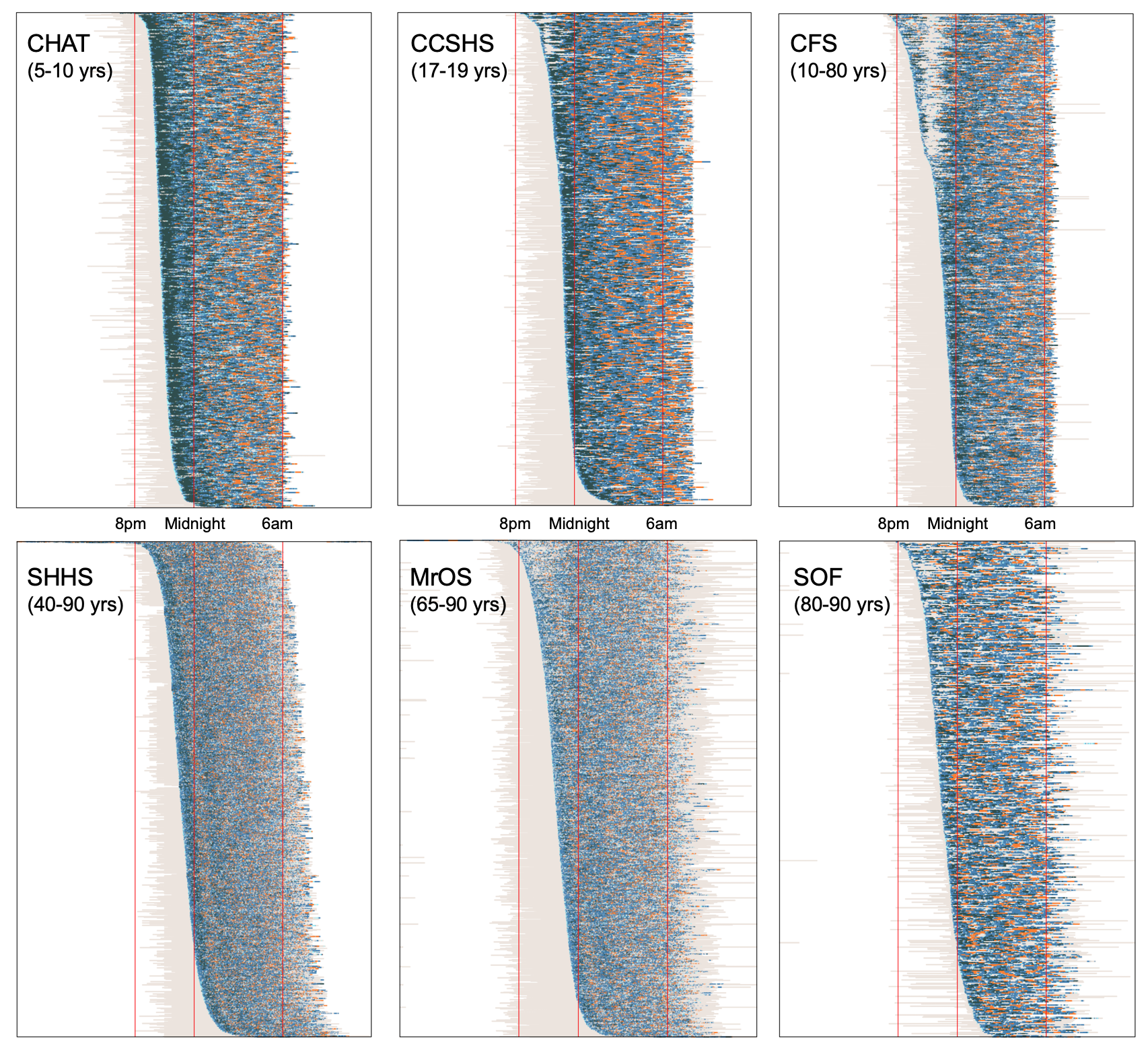
Comparing plots between cohorts illustrates a number of physiological and technical differences.
-
Some studies (e.g. SHHS and MrOS) contain an order-of-magnitude greater number of individuals compared to others (e.g. CHAT and SOF), and so when plotted at this resolution and scale, there is unavoidably more "smoothing" of points (which are plotted in a semi-transparent way) in the larger cohorts, i.e. as we can't get >5000 rows/pixels in one plot and still have it fit on a typical monitor. This makes the (important) point that different ways of visualizing data can induce or mask differences between datasets; e.g. to study SHHS dynamics more carefully, we'd need to plot this differently.
-
Nonetheless, certain other between-cohort differences are still clear. For example, as expected, there is generally less deep sleep in the older cohorts, compared to CHAT and CCSHS.
-
Comparing the adults cohorts to CHAT, CCHS and CFS, we see these studies have a more typical distribution of recording stop times: i.e. especially in SHHS, it is clear that individuals who go to bed later also tend to end their sleep later, as not all studies finish at the same time. In the SHHS, individuals were instructed to go to bed at their typical bed times, and so we might, to some extent, expect differences in sleep midpoint to reflect differences in chronotype (morning versus evening types). If we were to study sleep midpoint (i.e. the point midway between sleep onset time and final wake/end of recording), e.g. assuming it might reflect chronotype, a naive analysis in CHAT, CCSHS and CFS would report large but artifical negative correlations between sleep duration and sleep midpoint. That is, because of the design of the study, people who went to bed later will appear to have less sleep, as the recordings stop all around the same time in the morning. In contrast, in SHHS there is no significant correlation between sleep midpoint and total sleep time.
-
We might guess that in the SHHS, recordings stopped at the final wake, even though final wake is not included in the EDFs. In contrast, MrOS and SOF include epochs of final wake in many recordings.
-
In CFS (and less so CCSHS) there is a strange pattern whereby the people with the earliest sleep onset all tend to wake for about an hour or so (i.e. the top third of the CFS plot). On reviewing the CFS study's protocol, this reflects the fact that recordings were performed in a hospital setting, and CFS participants had blood draws or other tests scheduled at set times, i.e. around 10pm. This means that some individuals who fell asleep earlier were then awakened by study staff. This will naturally have some impact, e.g. likely inducing an artificial correlation between WASO and sleep onset time. Any analyses focussing on the timing and/or dynamics of sleep (e.g. modeling dissipation of delta power as a marker of homeostatic sleep pressure) should be particularly aware of this aspect of the data, which could otherwise confound things.
In any case, the point for our current purposes is simply to note that different visualizations of datasets can bring out feautures that otherwise might not be obvious but might nonetheless be important for a given analysis.
Signal dynamics
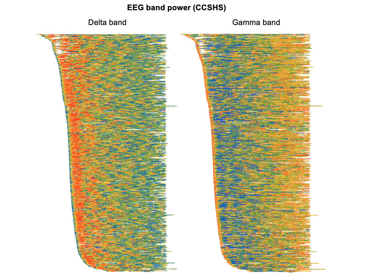
All the plots above represented sleep stage across the night using the color of points. Naturally, we can use the same framework to represent epoch-by-epoch changes in any sleep metric, e.g. for continuous metrics using a rainbow/heatmap scheme (here red/yellow/green/blue to reflect highest/higher/lower/lowest values). The plots below are all based on the CCSHS dataset, and consider spectral power in the EEG, Hjorth parameters for other signals, and finally, a more "exotic" metric from polysomnography (corticomuscular coherence, or synchrony between brain activity and muscle).
As above, the intention is simply to highlight one or two ways in which visualizations of data can be useful, both to highlight temporal dynamics in sleep signals and to spot potential artifacts and oddities. Of course, in many cases we could achieve much the same end result by plotting simple means as a function of clock time or elapsed time or sleep cycle, etc., rather than these temporally-aligned individual-level heatmaps. Nonetheless, the approach here may be useful if the ordering of individuals (i.e. y-axis) is chosen to be a relevant factor, e.g. if it modulates patterns of temporal dynamics. (And, of course, they are also more colorful!)
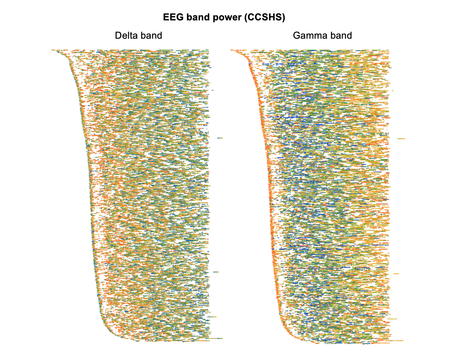
EEG spectral power
Here we see clearly how, in the left plot, absolute delta power in the EEG is highest near the start of the night and then dissipates. (Note that in these particular plots, we've normalized each individual to have similar whole-night levels, in order to highlight within-individual dynamics rather than between-individual differences. We'd still see the same basic pattern, in either case, though.)
The right plot shows changes in absolute gamma power, which shows an almost inverse dynamic compared to delta power. That is, around the first few minutes of sleep onset gamma power is high,then drops quickly, and then slowly builds up over the second half of the night:
By definition, EEG power changes with sleep stage. Recreating the above two figures but only for N2 epochs (below) we can still observe similar dynamics for delta and gamma power within nominally similar epochs however. (All epochs that are something other than N2 sleep are left a white/not plotted.) That is, the quantitative EEG metrics are capturing systematic differences in sleep above and beyond what is represented by traditional staging:
Dynamics and artifacts
Especially for sleep signals other than the EEG (for which spectral band power characteristics are familiar), Hjorth parameters are a convenient way to reflect their gross properties. The three parameters H1, H2 and H3 reflect activity (basically, a signal's typical amplitude), mobility (it's frequency) and complexity (it's variability). Here, we've generated plots for all wake as well as sleep epochs, to highlight some wake/sleep differences, but with the rows/individuals still ordered as above (i.e. by clock-time of sleep onset):
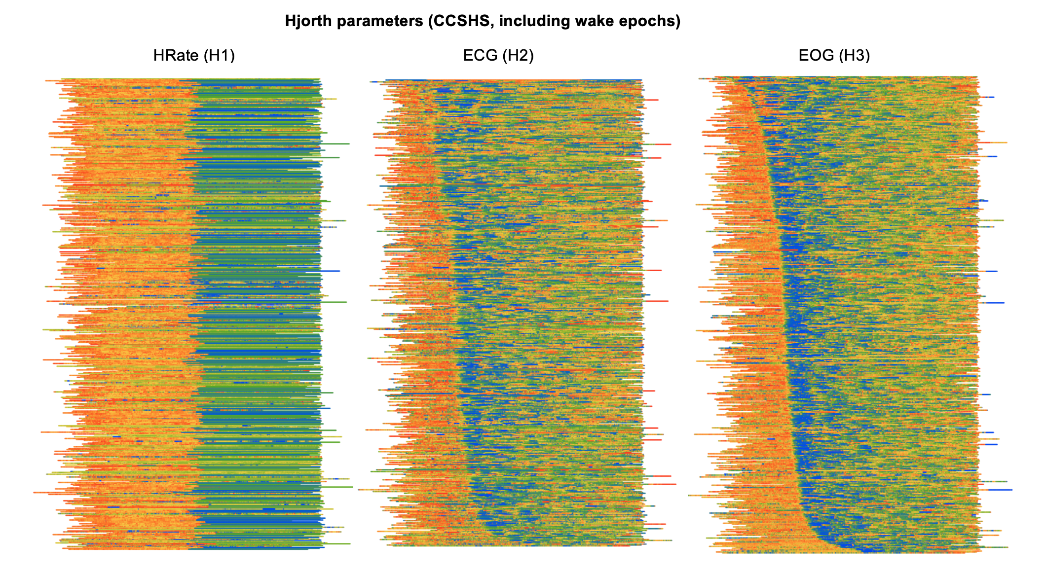
The leftmost plot shows activity (H1) for the HRate (derived
heart rate) channel in CCSHS. Clearly, there is an abrupt change that
occurs halfway through the recording. In fact, on inspection, we see
that this channel basically flat-lines at almost exactly the halfway
point of each recording, thus the apparent loss in information
content/variability for the second half of the night. So, in this
instance, visualization has helped to flag an obvious error with the
recording/data. (These derived channels will be removed from
subsequent releases of the CCSHS data.)
The other two plots show how different metrics for different signals (ECG and EOG) show wake/sleep differences, but also clear ultradian dynamics, e.g. the tendency for heart rate (as measured indirectly by the mobility of the ECG) to dip during deep sleep. That is, even though not explicitly indicated on the plots, the pattern of when sleep onset occurs (i.e. which will mirror the above plots) is readily apparent for both these metrics.
Other ultradian dynamics
Finally, polysomnography offers are rich set of possibities for investigating the interplay between different body systems. As a somewhat random and entirely data-driven exercise, here we look at the coupling between brain (EEG) and muscle activity (chin EMG), known as corticomuscular coherence. Typically studied in the context of explicit movements/motor commands, it can be indexed by spectral coherence. Here we show epoch-level imaginary coherence (which avoids volume conduction artifact) in the alpha (left plot) and beta (right plot) power bands. As with many of the above examples, there are clear temporal dynamics in this measure, that appear to track across all subjects, and show qualitatively different patterns for alpha and beta power; furthermore, this effect is seen if looking just within N2 sleep, and so reflects dynamic processes at a finer granularity than traditional staging.
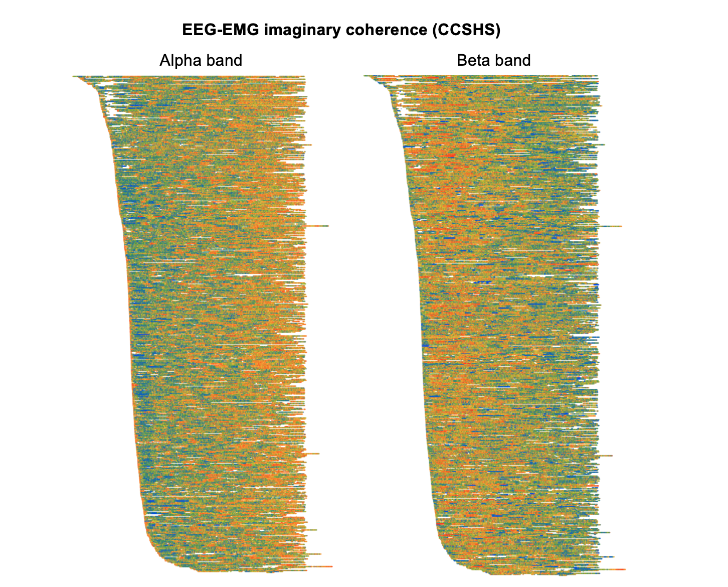
What does this particular result mean? Is it interesting? Personally, I've currently no idea... Again, the purpose here is to demonstrate the hypothesis-generating value of data visualization, inasmuch as different views of a dataset can bring what might otherwise be unappreciated features and facets to the fore.
So, the bottom line -- be sure to look at any data you download from the NSRR!